
ThredTax
A digital platform that allows you to donate your returns for a tax write-off rather then returning it in store.

Project Brief
ThredTax was a project that my partner, Rossy Ramos and I were assigned in our Intro to UX class at Pace University. Our professor tasked us with identifying a real-world problem and developing a digital solution for it. Rossy and I chose to address the issue of sustainability.
UI/UX Designer
Role
5 Months
Timeline
Intro to UX
Class
The Problem
Recent reports suggest that retailers are making more efforts to adopt environmentally friendly production and sales practices. However, it seems that the post-purchase process still poses sustainability challenges.
The Solution
My partner, Rossy Ramos, and I prototyped a digital platform that enables users to donate returned items in exchange for a tax write-off. Through extensive research and multiple rounds of prototyping, we focused on addressing sustainability challenges, particularly those linked to the fast fashion industry.

The Impact
By developing a digital platform that encourages users to donate goods instead of returning them, we aim to reduce the carbon footprint and promote greater sustainability within the fast fashion industry. We believe that offering a tax write-off as an incentive makes the process more appealing and increases user participation in adopting more eco-conscious behaviors.
Lets Dive In
↓
User Research
Through extensive online research, my partner Rossy and I came to a conclusion that we will be designing for a wide variety of individuals who may or may not be tech savvy. We decided to start by creating an unmoderated survey for participants between the ages of 18-60 to complete.
Survey & Results
The charts and graph shown below are a few results we compiled from our unmoderated surveys.
The complete survey with all questions is available here

Interviews & Findings
After getting the chance to interview three managers from different retail companies, we were able to get an inside scope on how returns are processed, what happens with the returned items when they’re processed, and how their companies are promoting sustainability.

User Flow
Based on my findings and persona, I created a flowchart to map the user journey for the website add-on, helping me prioritize essential screens and steps.
Feel free to take a closer look at my flow-chart here


User Persona
After analyzing our results from the surveys we created and interviews we moderated, we were able to picture the ideal user for our platform.

Site Map Navigation
Organizing the content for the onboarding process was essential to the structure of this design. We anticipate that users will engage with the onboarding process the most on our platform.
Low-Fidelity Wireframes
After finalizing our flowchart, I began designing low-fidelity wireframes to help visualize the structure and layout of our platform. Below are a few early-stage onboarding screens that I prototyped in Figma, providing a first look at the user journey and overall design direction.


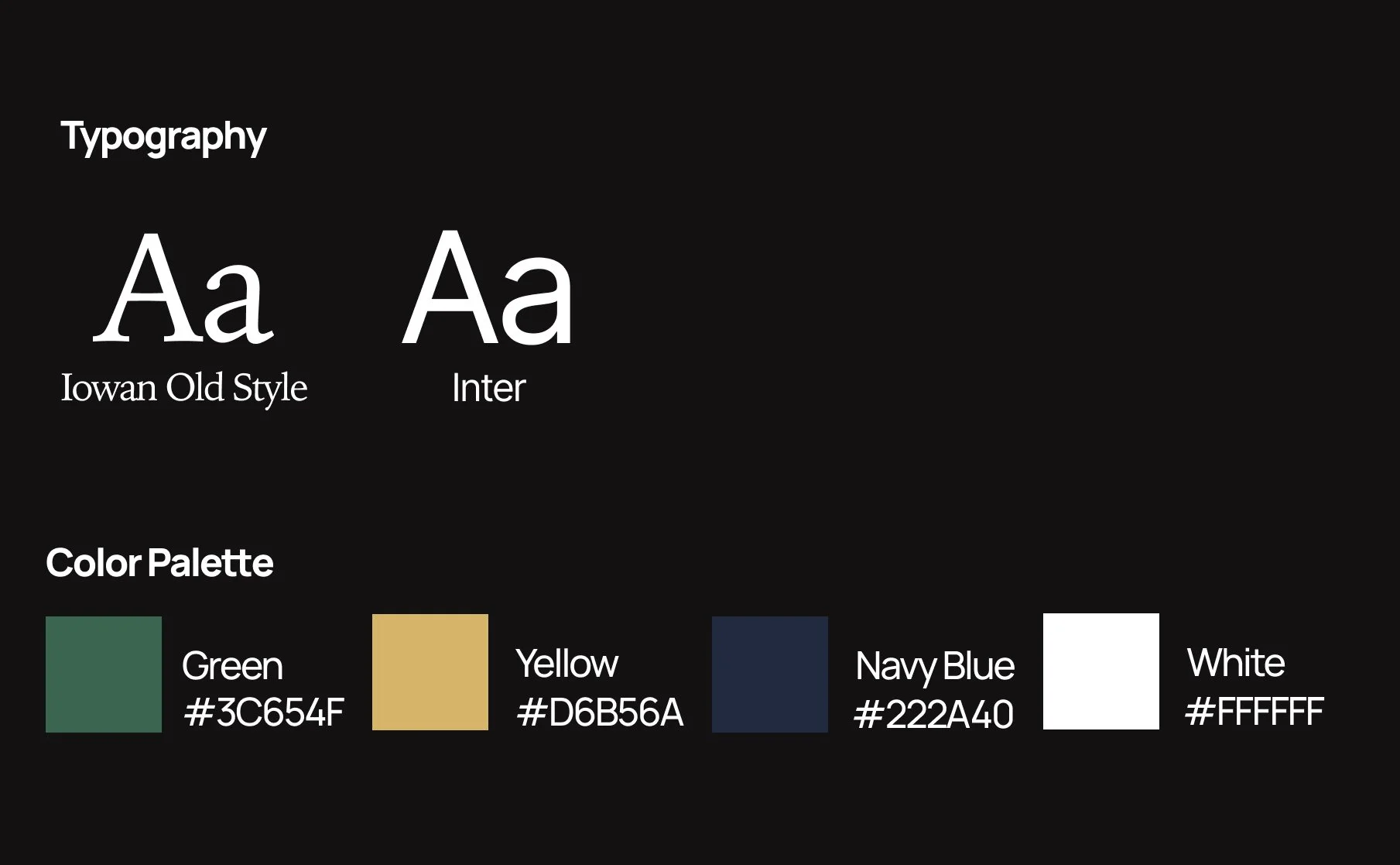
Typography and Color
When selecting colors for the overall design I decided to go with earth tones that compliment the idea of sustainability. For typography, I wanted to go with a simple font that would blend well with the minimalist aesthetic of the platform.
The Final Product
I began applying the colors and fonts to my low-fidelity wireframe. After this phase in my design process I was very pleased with how my color palette and font selection blended with the overall aesthetic.


Feature 01 - Onboarding Progress Bar
Incorporating a progress bar into the onboarding process was essential for enhancing user clarity and engagement. It provides users with a clear sense of their current position, what steps remain, and what they’ve already completed, creating a more transparent, guided, and reassuring experience from start to finish.

Feature 02 - Customer Testimones
Including a section where customers can share their personal stories and experiences with the donation process helps build trust and emotional connection with new users. These testimonials not only highlight the positive impact of the platform but also encourage others to engage with the process. Our goal with this feature was to support business objectives by driving user interest, credibility, and community engagement.

Usability Testing
To assess whether my high-fidelity prototype was functional enough for real-world use, I created two tasks for six participants aged between 23 and 56 to complete. This test allowed me to identify any user pain points and validate the strengths of my prototype. Overall, all six participants confirmed that my high-fidelity prototype was a well-organized design with an intuitive layout.

Key Takeaways
After conducting user testing, research, and working on the overall design of this project, I feel confident in the skills I have gained. I developed new strategies for conducting user testing and learned how to apply both qualitative and quantitative data to produce actionable insights that impact the overall design of my final deliverable. Although, my partner and I had limited time with the final deliverable of this project, we were rewarded with an A for our final grade.
Explore another case study


Interaction Design
Behind The Wheel
Tesla HVAC Redesign
Automotive UI & User Research
Smartko
Product Design & User Research